Bonani DOSH, Dhaka - 1230, Bangladesh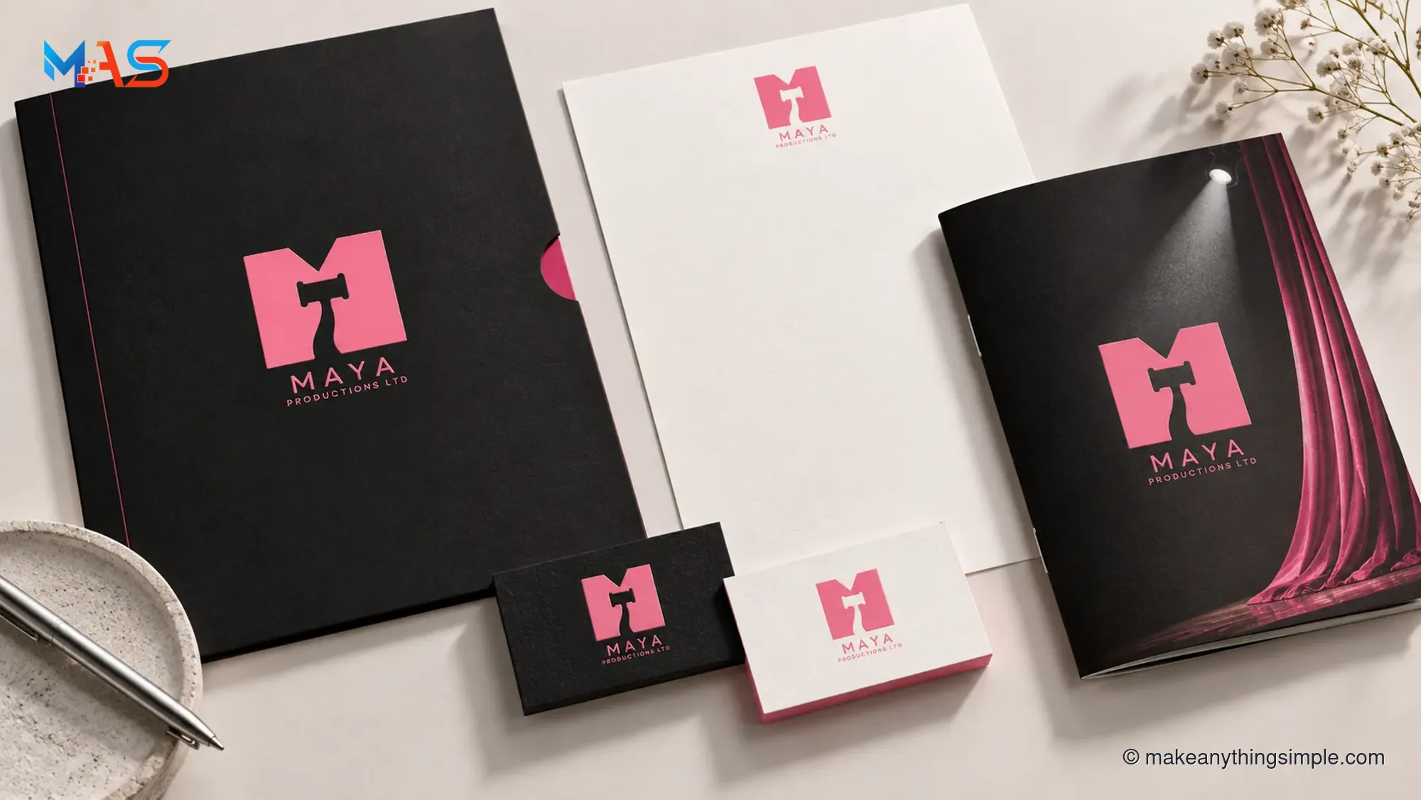
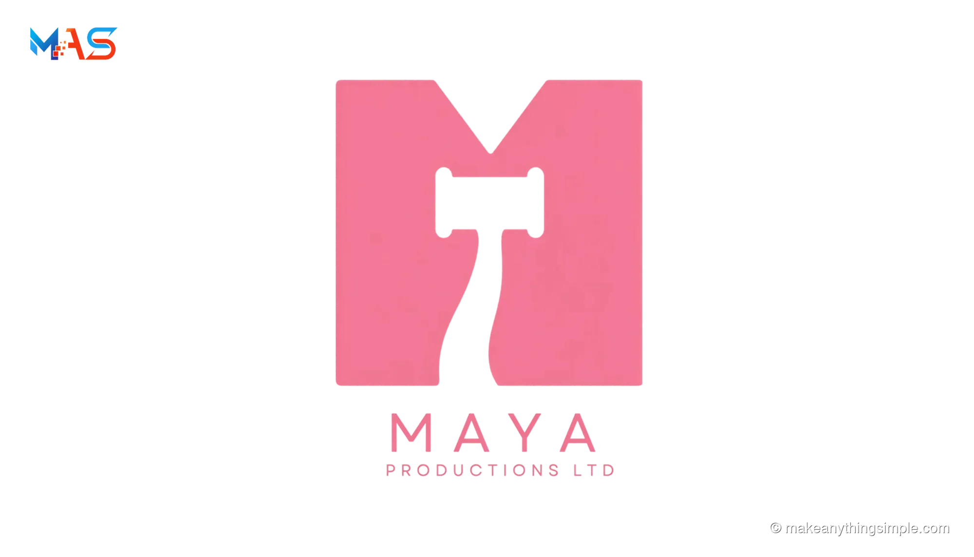
The visual identity for Maya Productions Ltd begins with a confident rose-pink monogram and a clear, sharply spaced wordmark. I shaped the concept to feel bold at a glance while remaining simple to reproduce across digital and printed formats.
The M mark acts as a compact visual signature. Rose pink against black and white creates strong contrast, while generous spacing keeps the full company name readable across sizes.
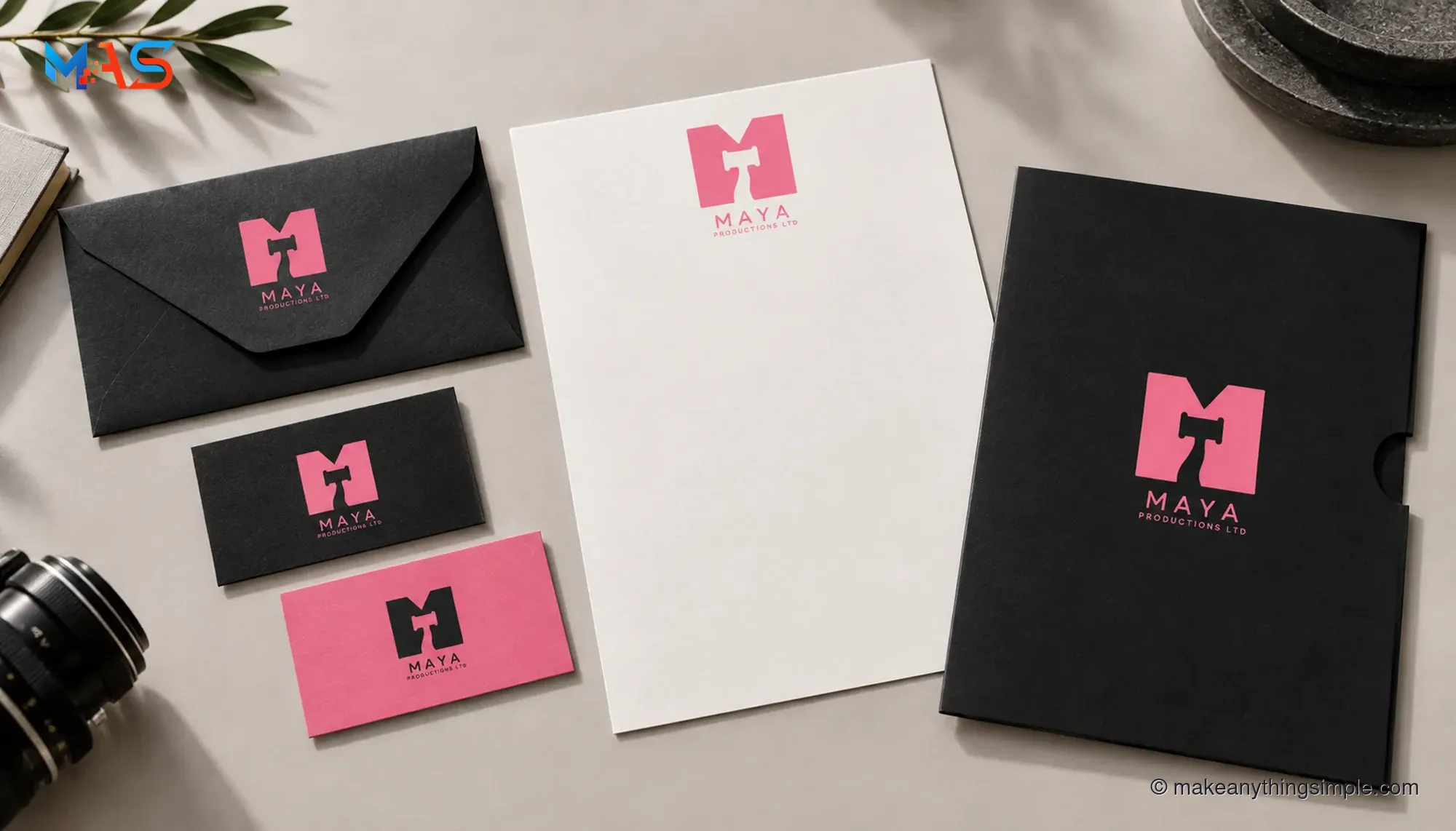
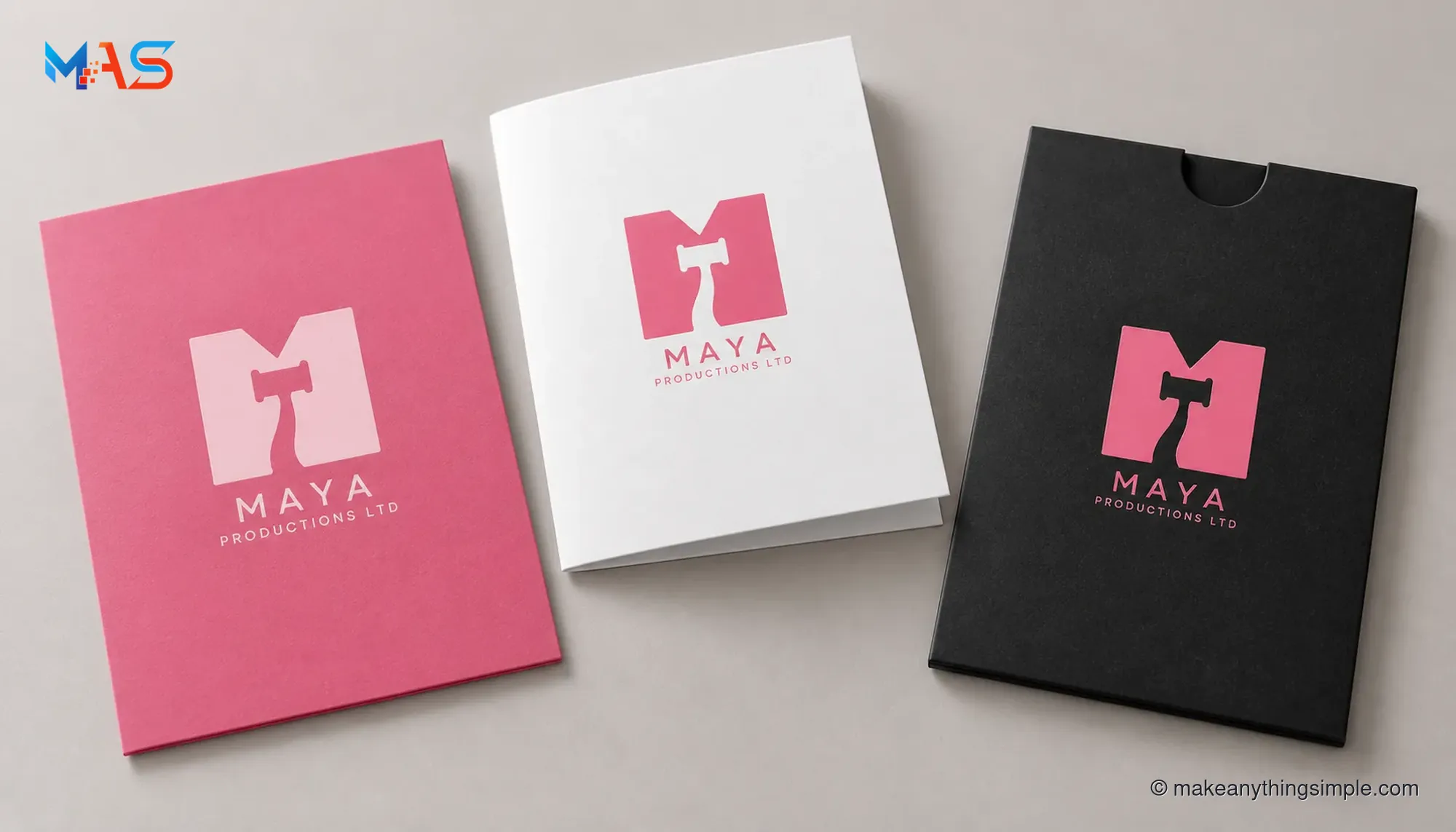
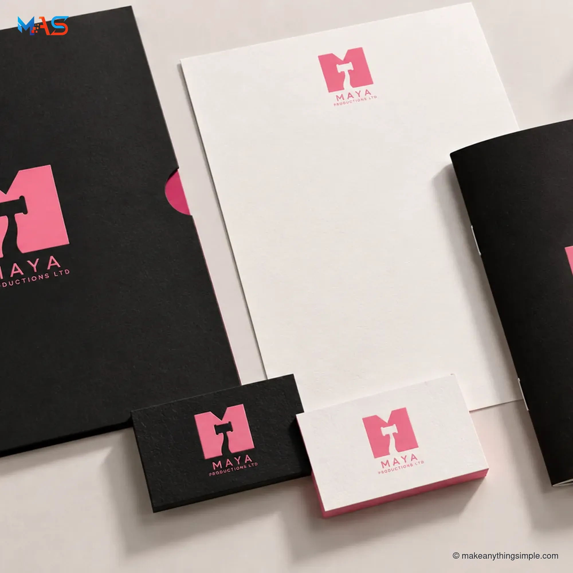
I explored practical applications through business-card, letterhead, envelope and presentation-folder mockups. Together, they show how one consistent mark and a restrained palette can carry through a small print system.
The client was very pleased with the finished direction. The images in this case study are original concept mockups created to present the design across potential print touchpoints.